Project Summary:
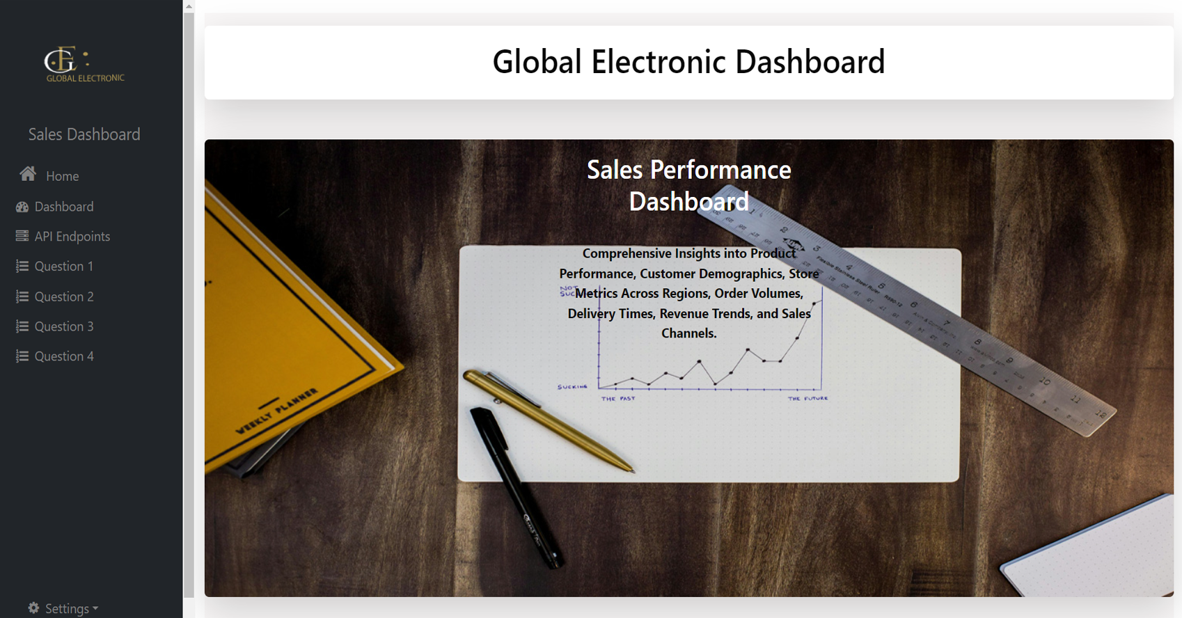
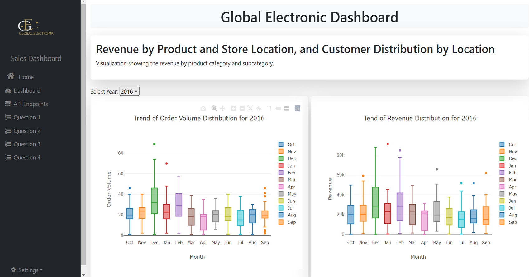
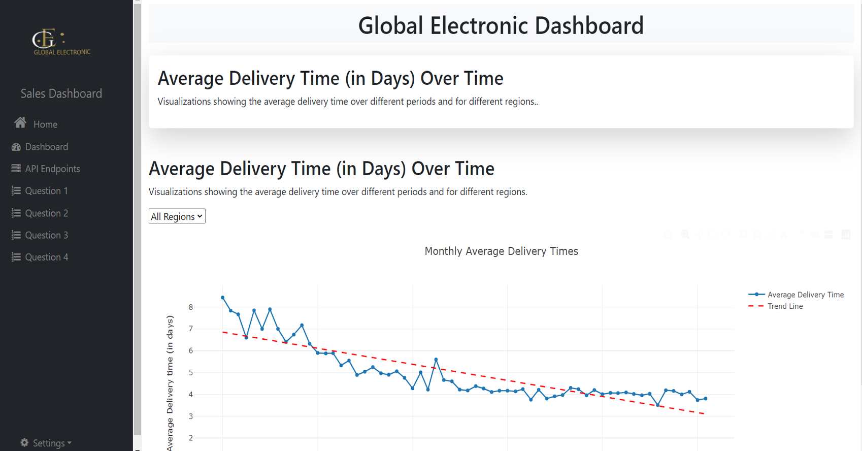
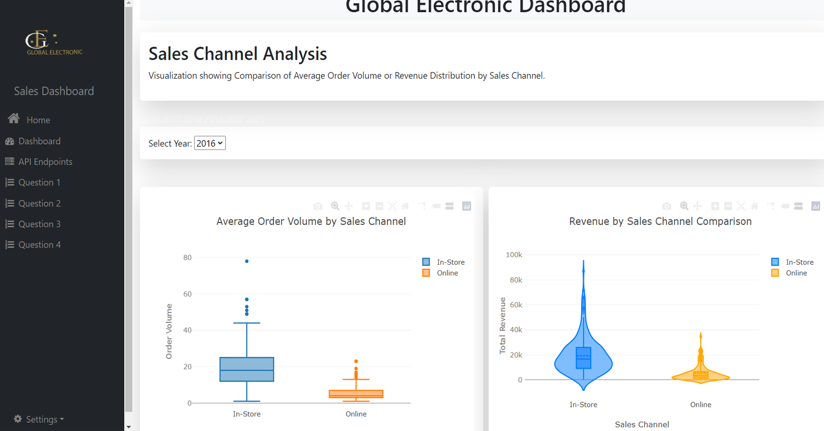
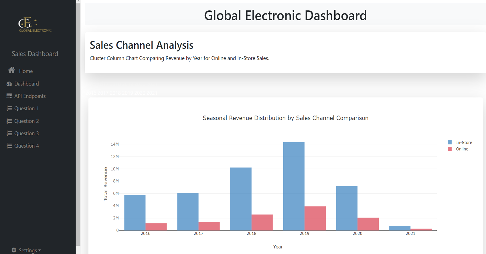
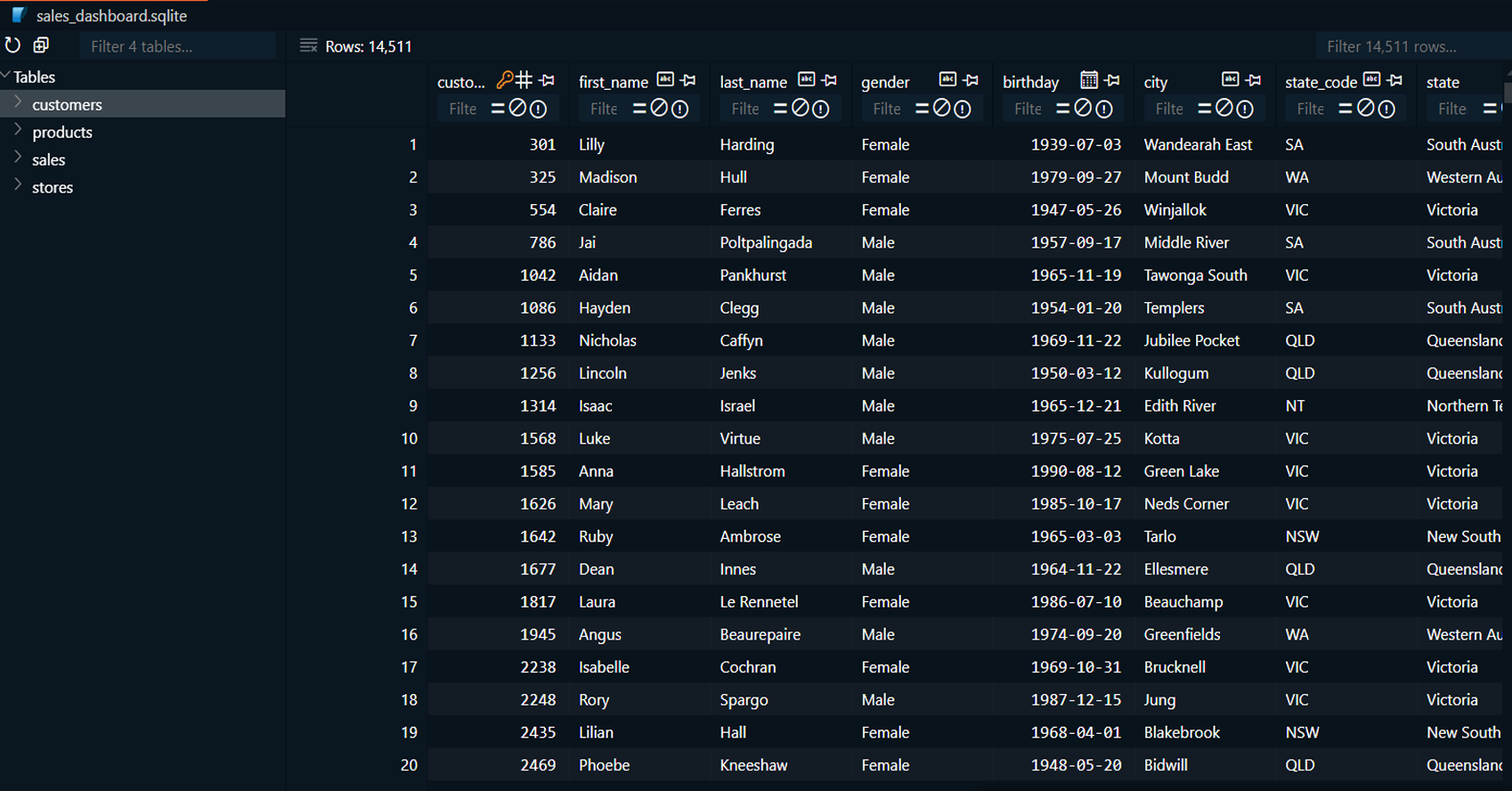
This project focuses on analyzing global electronic sales
data to gain insights into various aspects of the business.
By exploring product performance, customer demographics,
store efficiency, sales channels, and time-series trends, we
provide actionable insights to improve decision-making. The
project is divided into several tasks, with each team member
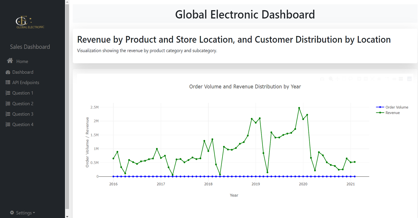
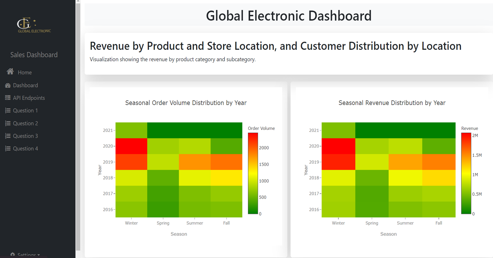
contributing specific analyses, including revenue
distribution, customer location mapping, seasonal trends,
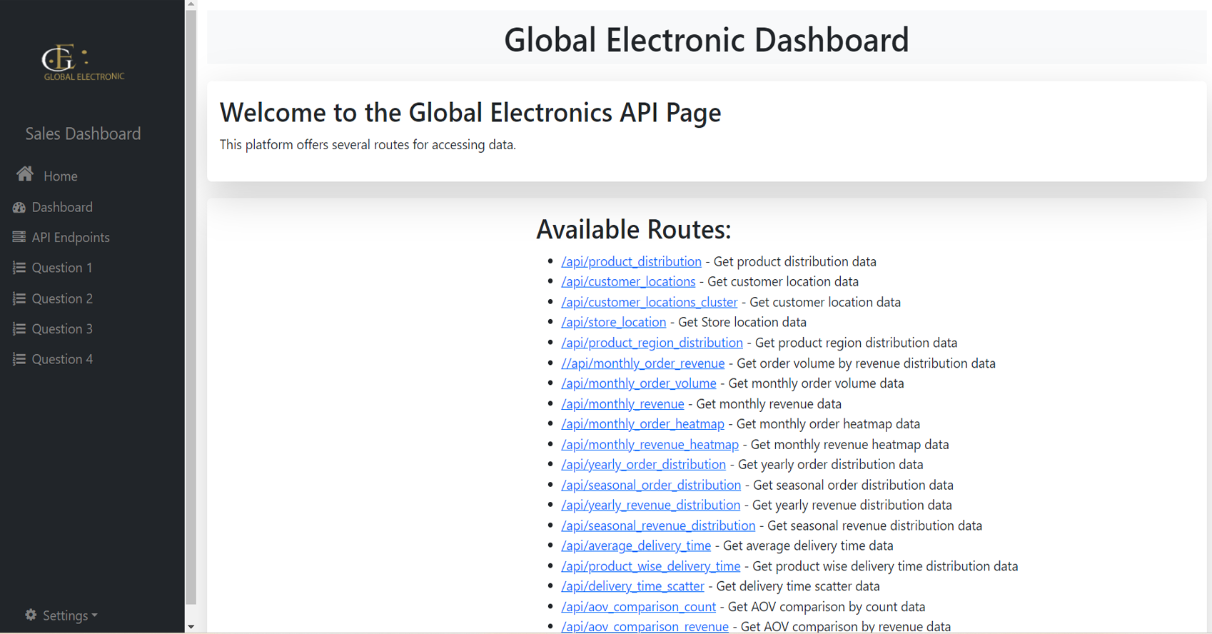
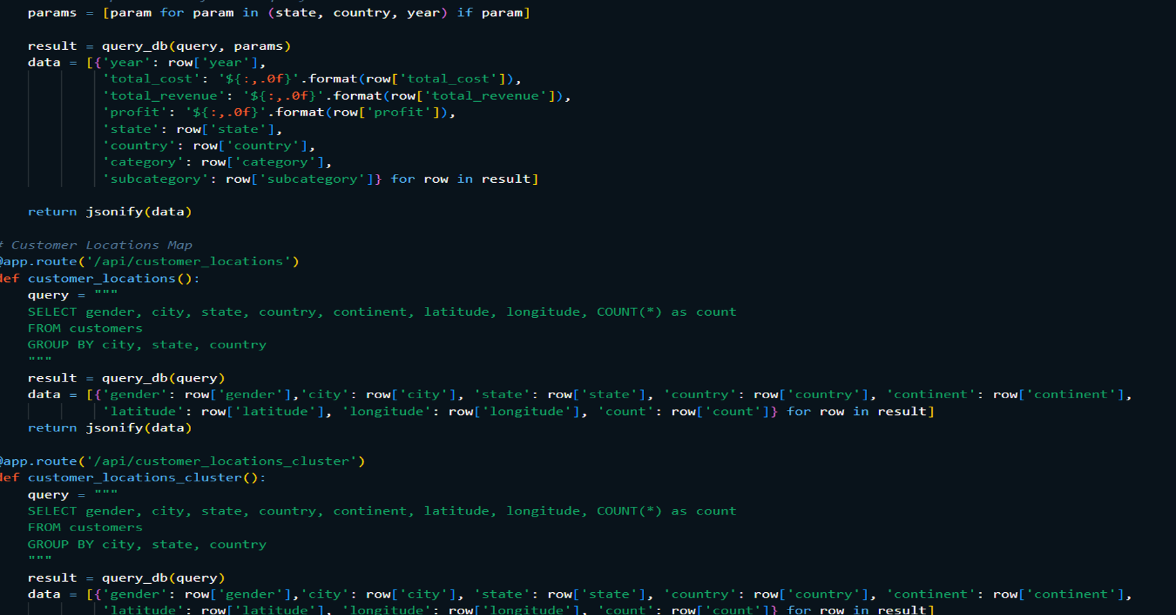
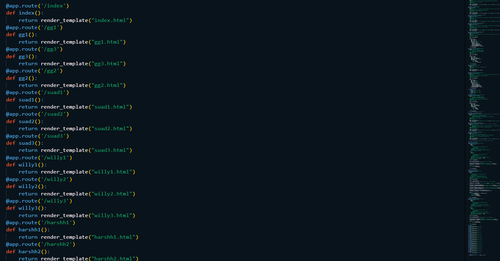
delivery times, and sales channel performance. A dashboard
was developed using Flask to present visualizations for
stakeholders, enabling real-time exploration of the data.
Read More
Technologies:
-
Programming Languages:
Python, SQL, and JavaScript (HTML, CSS).
-
Visualization Tools: Geographic Cluster
Maps, Line Charts, Stacked Column Charts, Heat Maps, Pie
Charts, Box Plots, Violin Plots and Column Charts.
-
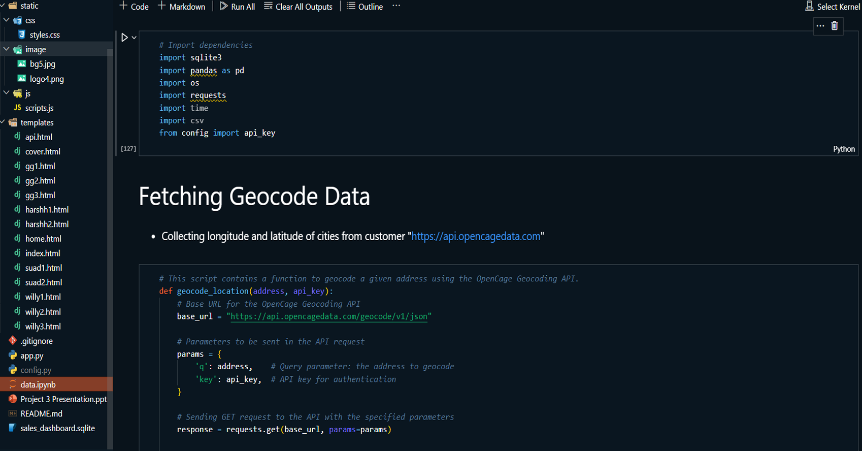
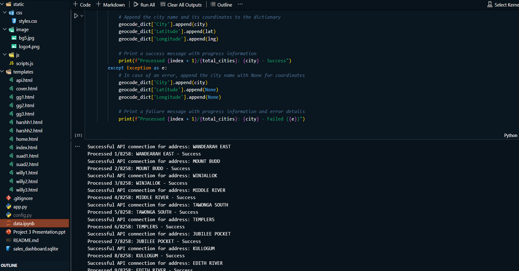
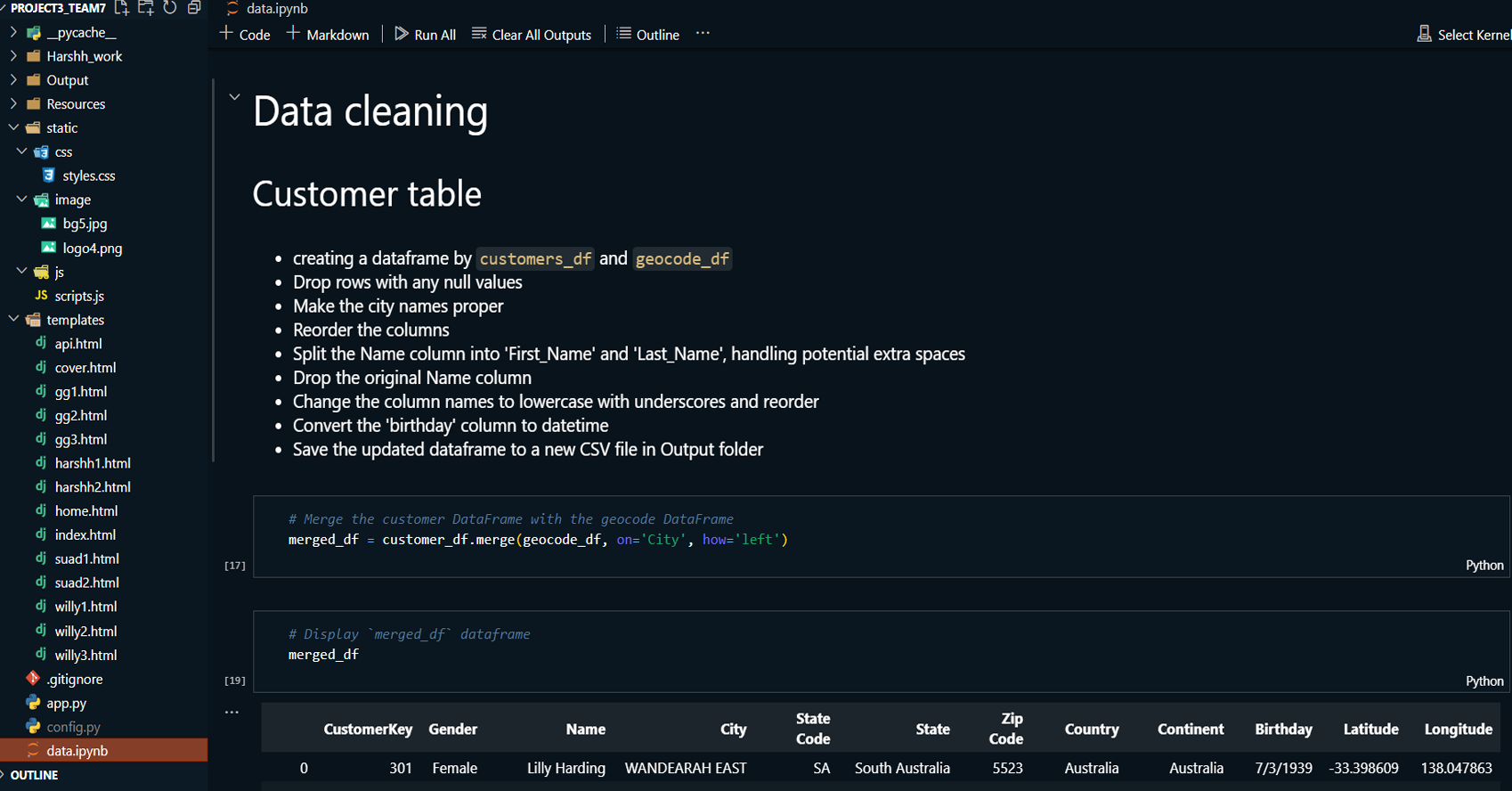
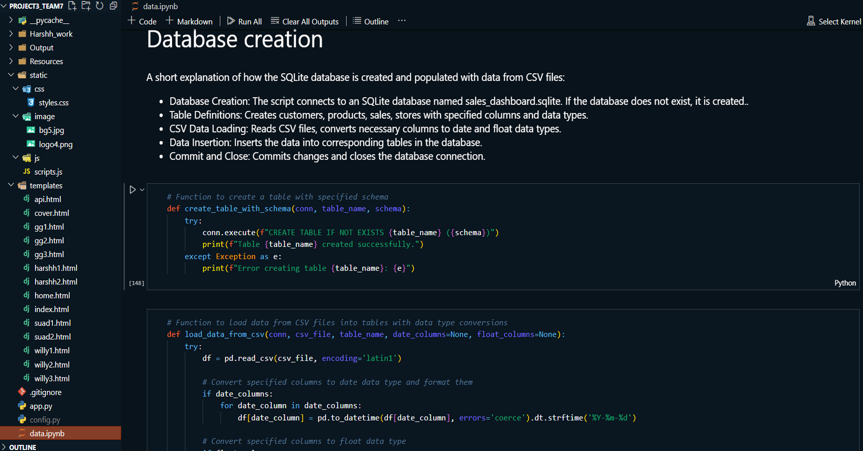
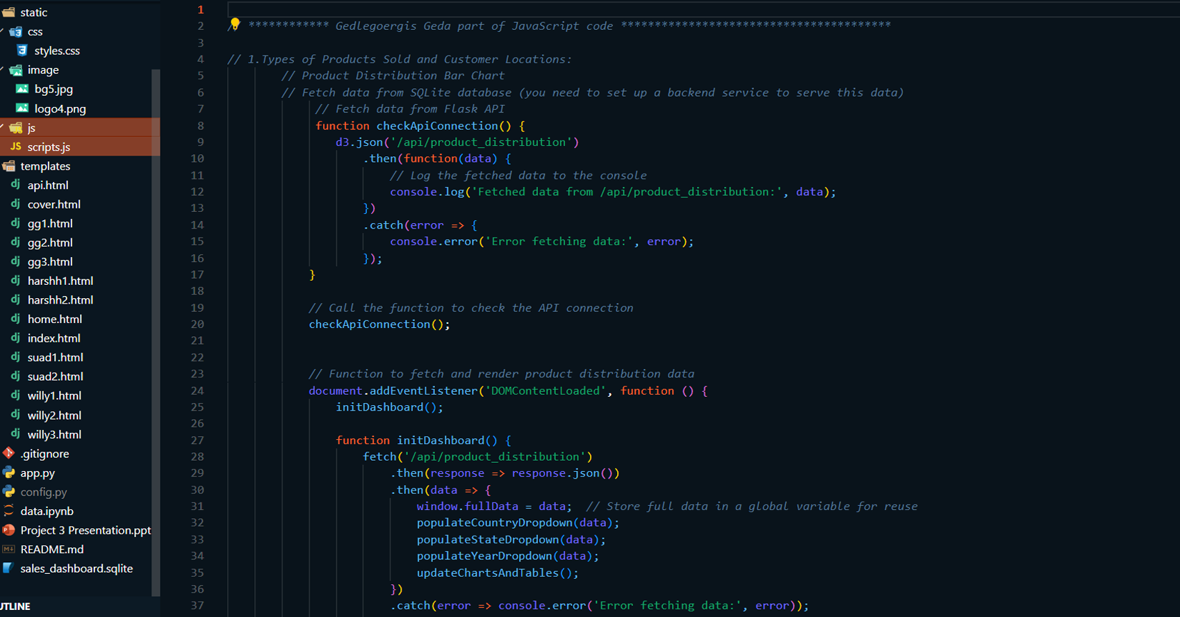
Libraries and Resources: sqlite3,
pandas, numpy, requests, Flask, Leaflet.js, Leaflet
MarkerCluster (via CDN), Font Awesome (via CDN), Google
Fonts (via CDN), CSS Stylesheets (Custom & External),
Bootstrap and Ionicons (via CDN).
- Database: SQLite
-
Dashboard: Flask for dynamic web-based
dashboard with interactive features.
- Version Control: Git, GitHub.
Contributions:
-
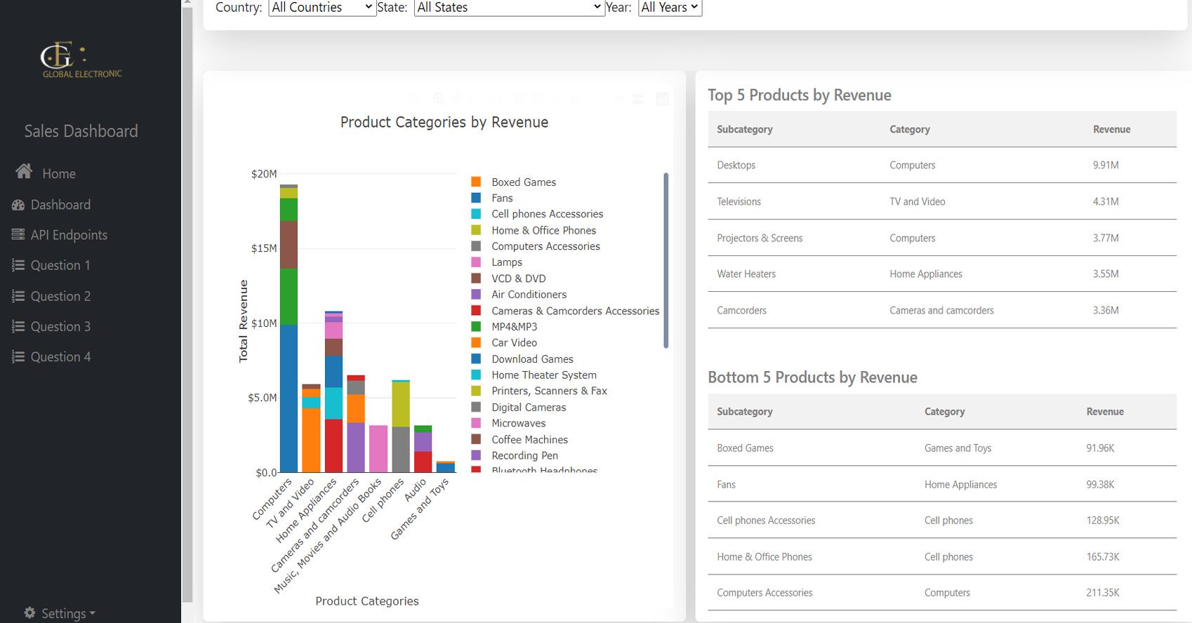
Product Revenue Distribution Analysis:
-
Analyzed product performance across regions using a
stacked column chart to determine top-performing
products.
-
Tools used: Stacked Column Chart, and
Perfomance Table
-
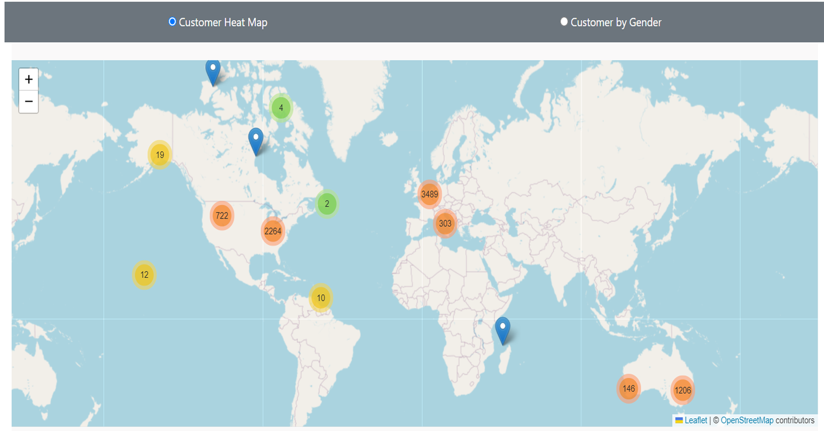
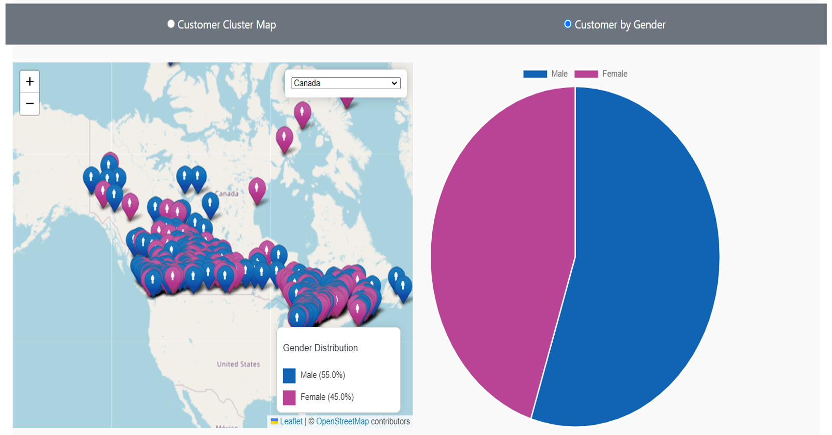
Customer Demographics Analysis:
-
Assessed purchasing patterns based on customer
demographics (age, gender, income) to identify
target audiences.
-
Tools used: Geographic cluster Map,
Geographic maps, and Gender distribution pie charts
-
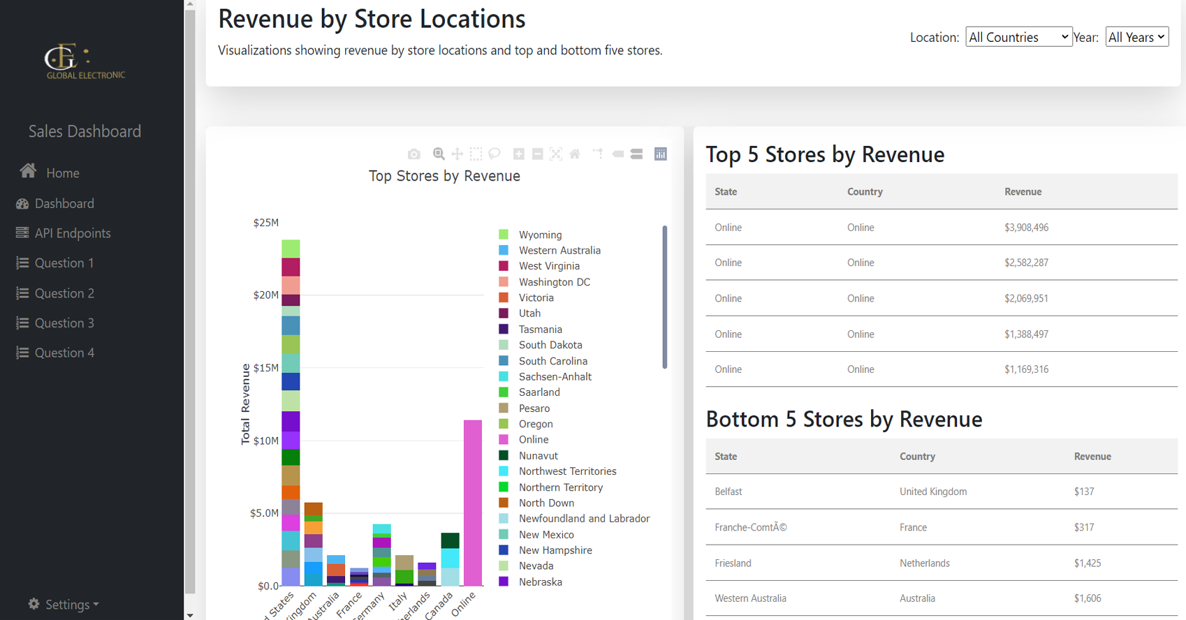
Store Performance Analysis:
-
Analyzed the revenue and sales trends of stores
based on their geographic location to identify
top-performing and underperforming stores.
-
Tools used: Stacked Column Chart, and
Perfomance Table
-
Model Evaluation and Selection:
-
Developed a Flask-based dashboard to present the key
visualizations interactively.
-
Integrated the SQLite database for dynamic querying
and data access.
-
Collaborated with other team members to ensure data
integration and visualization.
GitHub Link: To see my project on GitHub
please click GitHub Repository button below
Project Summary:
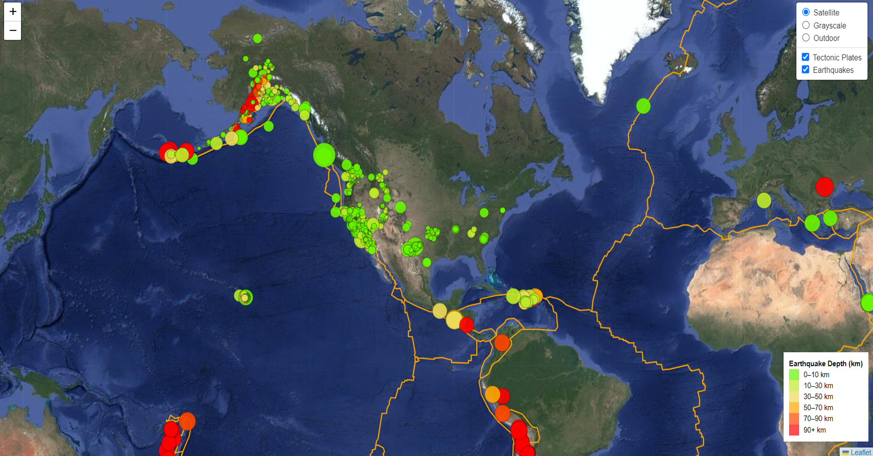
This project leverages Leaflet.js and D3.js to create an
interactive map for visualizing real-time earthquake data
and tectonic plate boundaries. The map is dynamically
updated with data fetched from the USGS Earthquake API,
displaying earthquakes as circle markers that vary in size
and color depending on the earthquake’s magnitude and depth.
In addition, multiple tile layers, including satellite and
terrain views, enhance the user experience by offering
different perspectives of the map. The project provides an
interactive experience where users can toggle between layers
and view earthquake information in real time.
Read More
Technologies:
-
Leaflet.js: For rendering the
interactive map and visualizing different map layers
(satellite, grayscale, terrain) and overlays..
-
D3.js: For data binding and dynamic
creation of SVG elements based on earthquake data.
-
OpenStreetMap API: Provides the base
map layers.
-
USGS Earthquake API: Source of
real-time earthquake data.
-
Tectonic Plates GeoJSON: For
visualizing tectonic plate boundaries.
-
HTML/CSS: For the structure and styling
of the web application.
-
JavaScript: For logic, map control, and
interactivity.
-
GitHub: For version control and project
collaboration.
Highlighted Skills:
-
Earthquake Data Visualization:
Developed the functionality to fetch real-time
earthquake data from the USGS API and dynamically render
them on the map using circle markers that vary in size
and color based on the earthquake’s magnitude and depth.
-
Map Customization: Implemented multiple
tile layers (satellite, grayscale, terrain) for users to
switch between different map views.
-
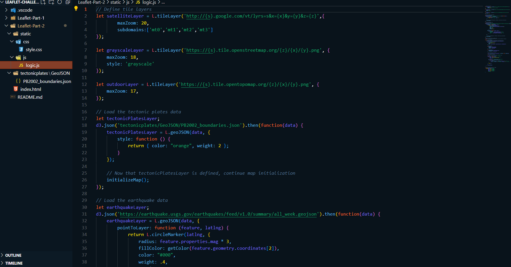
Tectonic Plates Integration: Loaded and
displayed tectonic plate boundaries using GeoJSON data,
creating an informative overlay on the map.
-
Legend and Layer Control: Added an
interactive legend and control to allow users to
understand the color coding and switch between layers.
-
Data Binding with D3.js: Used D3.js to
bind data for dynamic map marker updates and pop-up
information when interacting with the map.
GitHub Link: To see my project on GitHub
please click GitHub Repository button below
Project Summary:
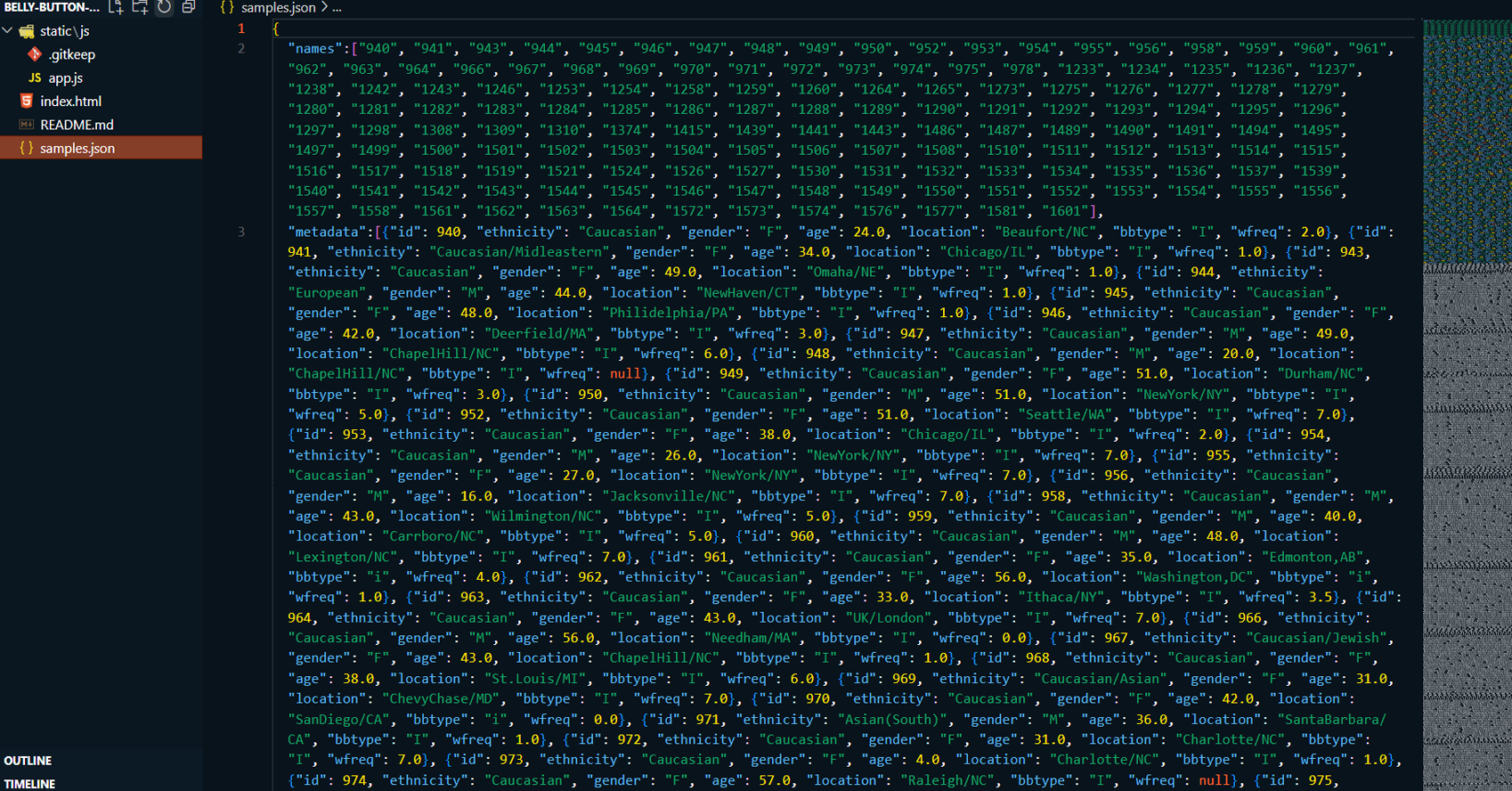
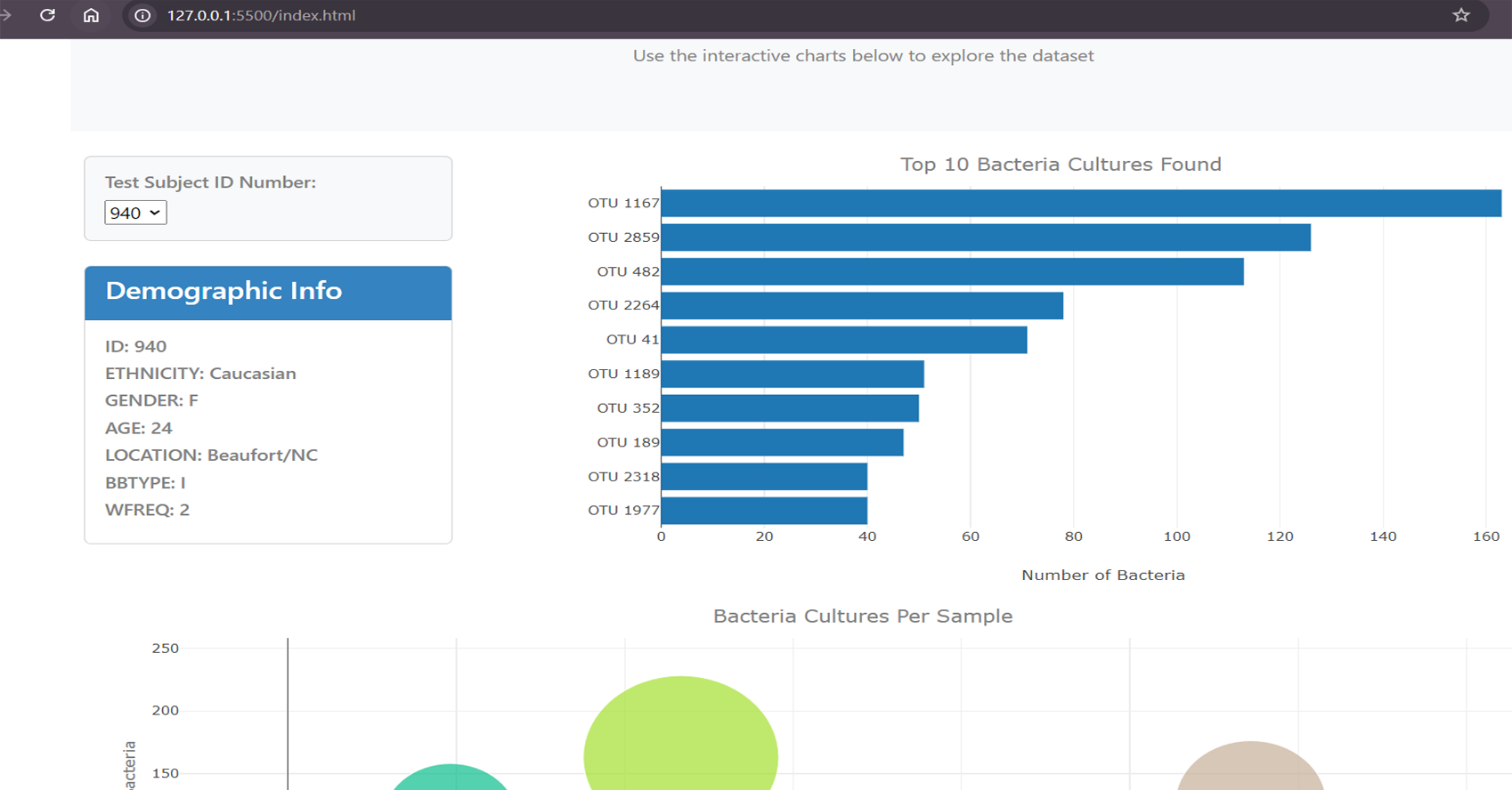
This project involves the development of an interactive
dashboard that visualizes the Belly Button Biodiversity
dataset. The dashboard allows users to explore microbial
species (Operational Taxonomic Units, OTUs) that reside in
human navels. It features visualizations such as bar charts,
bubble charts, and a metadata display that updates
dynamically based on user input. The goal of the project is
to showcase the most prevalent OTUs and provide a deeper
understanding of the microbial diversity across individuals.
Read More
Technologies:
-
D3.js: Used for fetching data from a
remote JSON file and for creating the interactive
visualizations such as bar charts and bubble charts.
-
JavaScript: For managing dynamic user
interactions and updating visualizations.
-
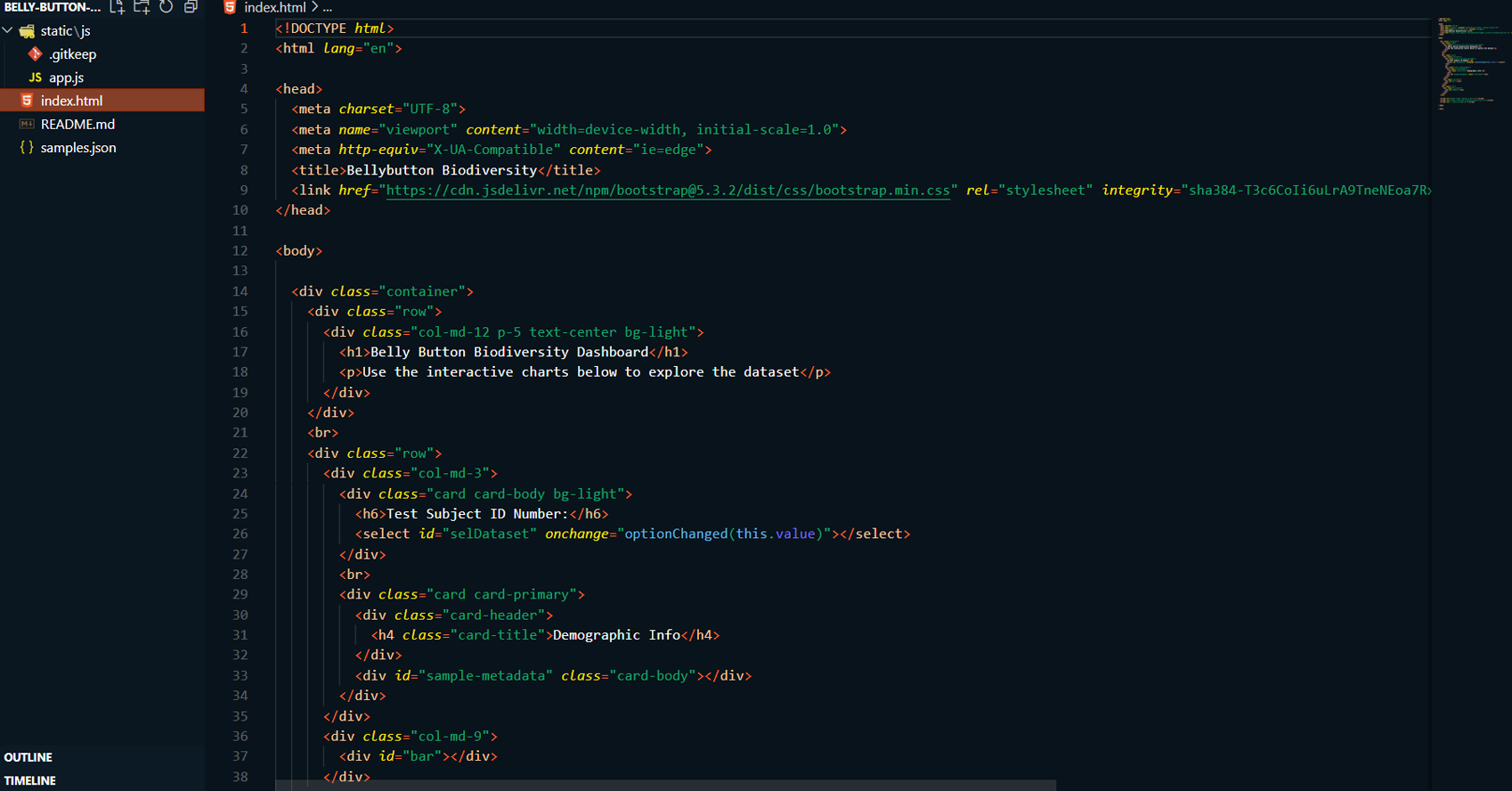
HTML/CSS:: Provides the structure and
styling for the dashboard layout..
-
Bootstrap: For responsive design and
layout components.
-
Plotly.js: Used for rendering
interactive bar and bubble charts within the dashboard.
-
JSON: For storing and transferring
sample data, which includes microbial species and
demographic information.
Highlighted Skills:
-
Data Integration: Connected the
dashboard to a remote JSON file using D3.js to fetch
microbial and demographic data.
-
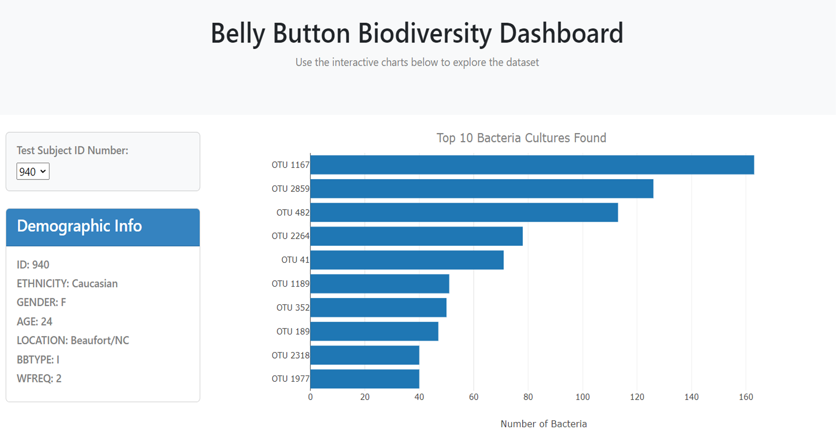
Bar Chart Visualization: Implemented
the dynamic bar chart that displays the top 10 OTUs for
each sample. This includes hovertext for enhanced
interaction.
-
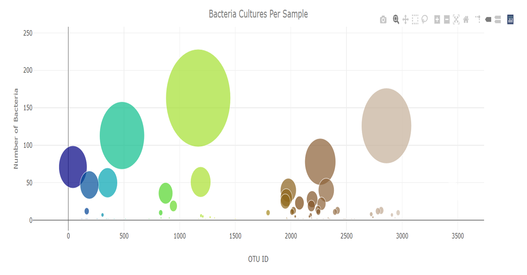
Bubble Chart Visualization: Developed
the bubble chart using Plotly.js to represent the full
spectrum of OTUs, where bubble size and color represent
sample values and OTU IDs.
-
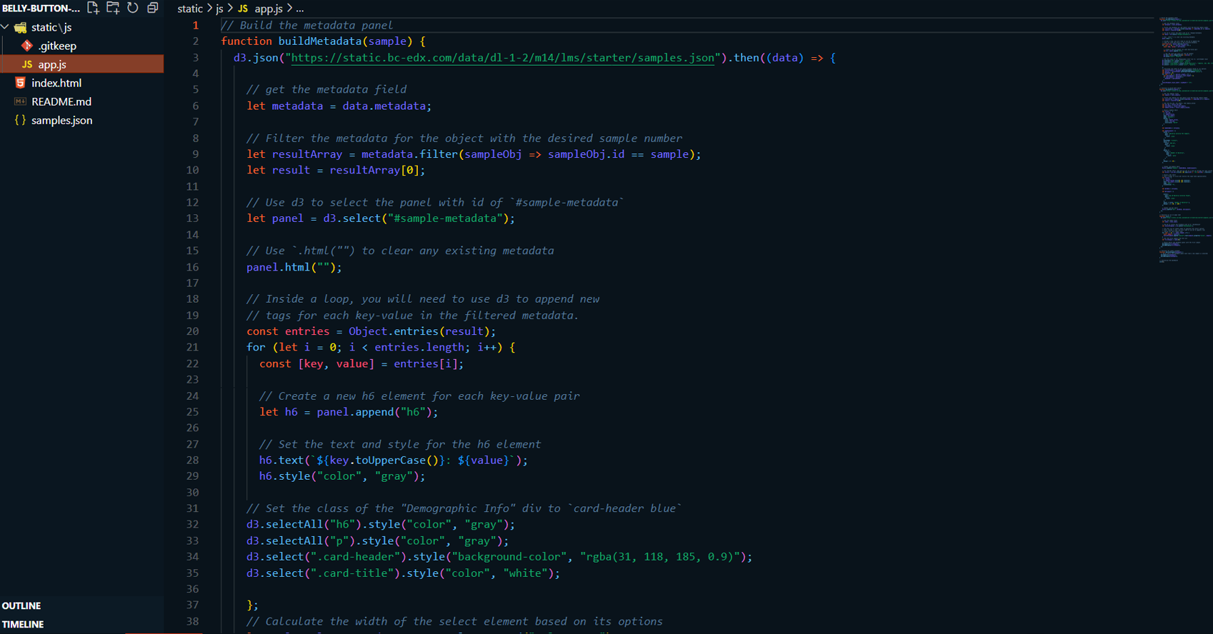
Metadata Panel: Designed the metadata
display to show demographic information, ensuring it
updates based on the selected sample.
-
User Interaction: Built a fully
functional dropdown menu to allow users to select a
sample and trigger the updates for all visualizations
and metadata.
GitHub Link: To see my project on GitHub
please click GitHub Repository button below
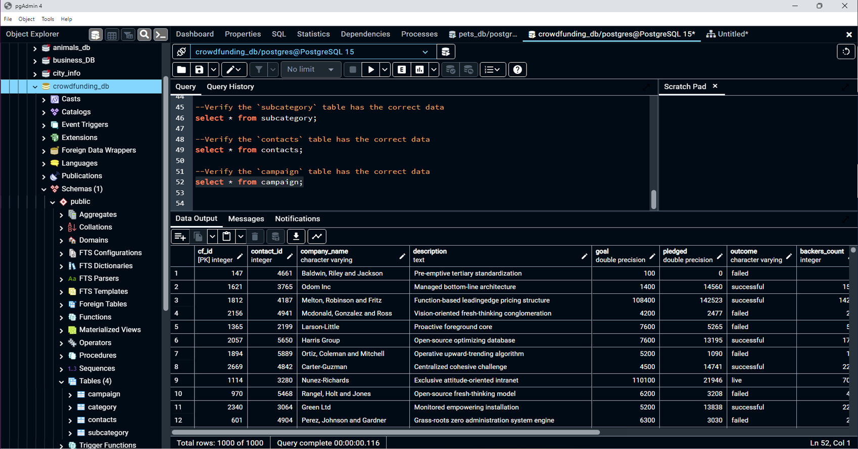
Project Summary:
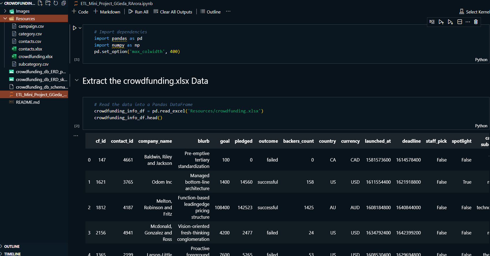
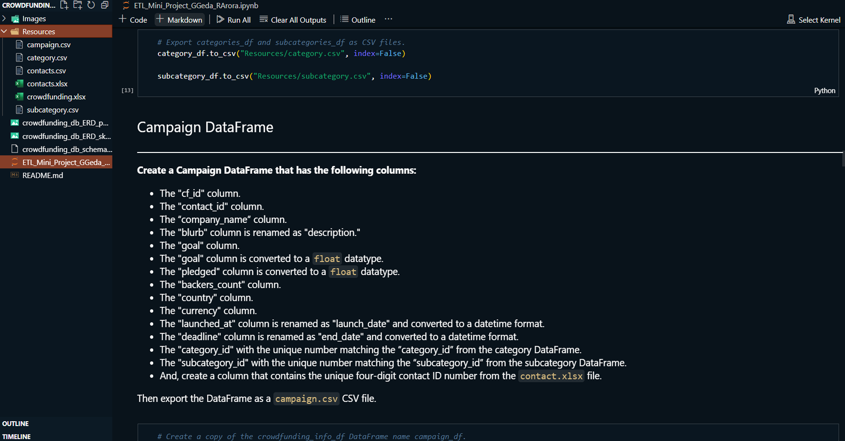
This project focuses on the ETL (Extract, Transform, Load)
process for managing data from a crowdfunding platform. It
involves extracting data from Excel files, transforming it
into appropriate formats, and loading it into a PostgreSQL
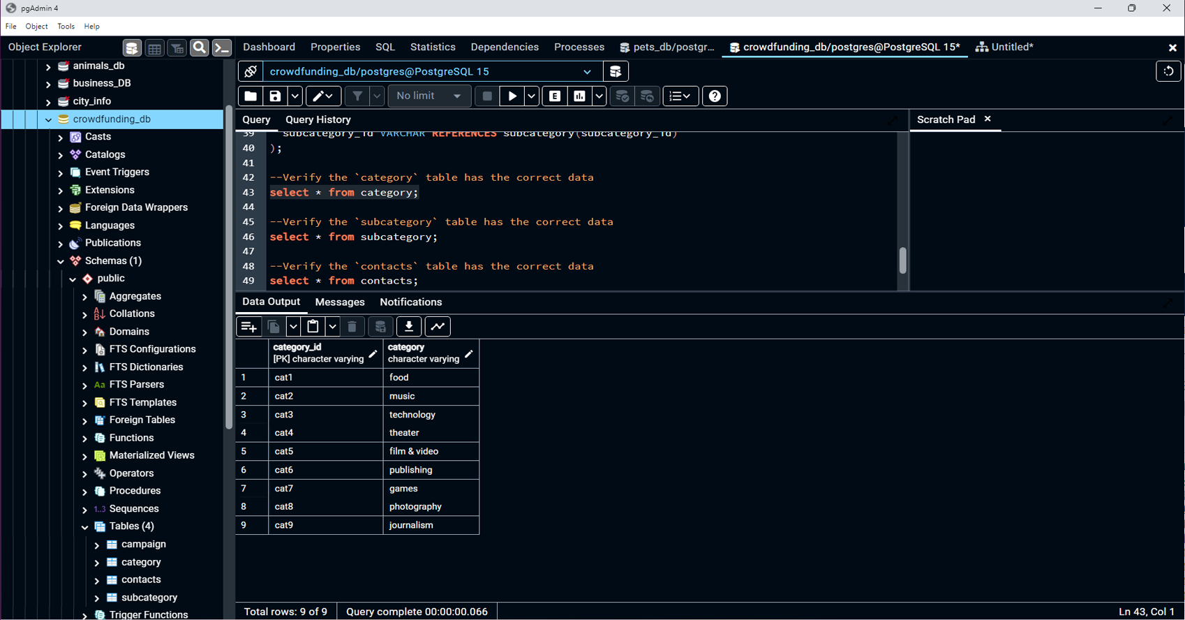
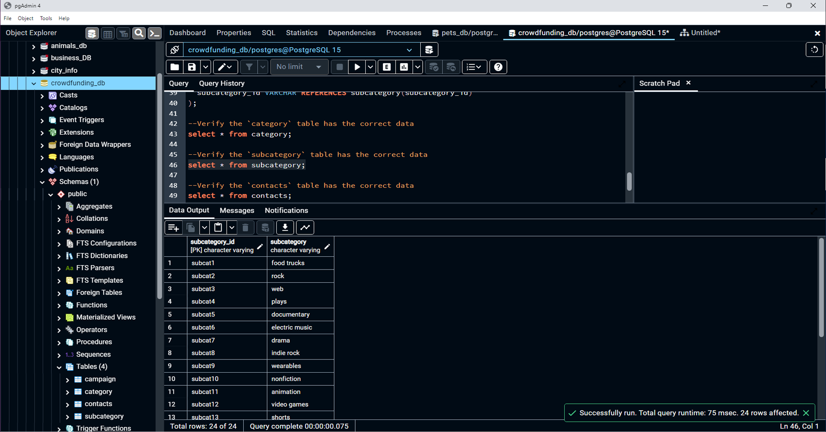
database. The project encompasses creating various
DataFrames for categories, subcategories, campaigns, and
contacts, and then using this data to populate and verify a
database.
Read More
Technologies:
-
Python(pandas): For data extraction,
transformation, and manipulation.
-
SQL(PostgreSQL): For database schema
design, data loading, database management and storage.
-
Jupyter Notebook: For documenting and
executing ETL steps.
-
Excel: For the source data files.
-
pgAdmin: For database management and
visualizing the database schema.
Contributions:
-
Data Extraction and Transformation:
-
Extracted and transformed data from Excel files into
pandas DataFrames for categories, subcategories,
campaigns, and contacts.
-
Processed and cleaned data, including converting
data types and handling missing values.
-
Database Schema Design:
-
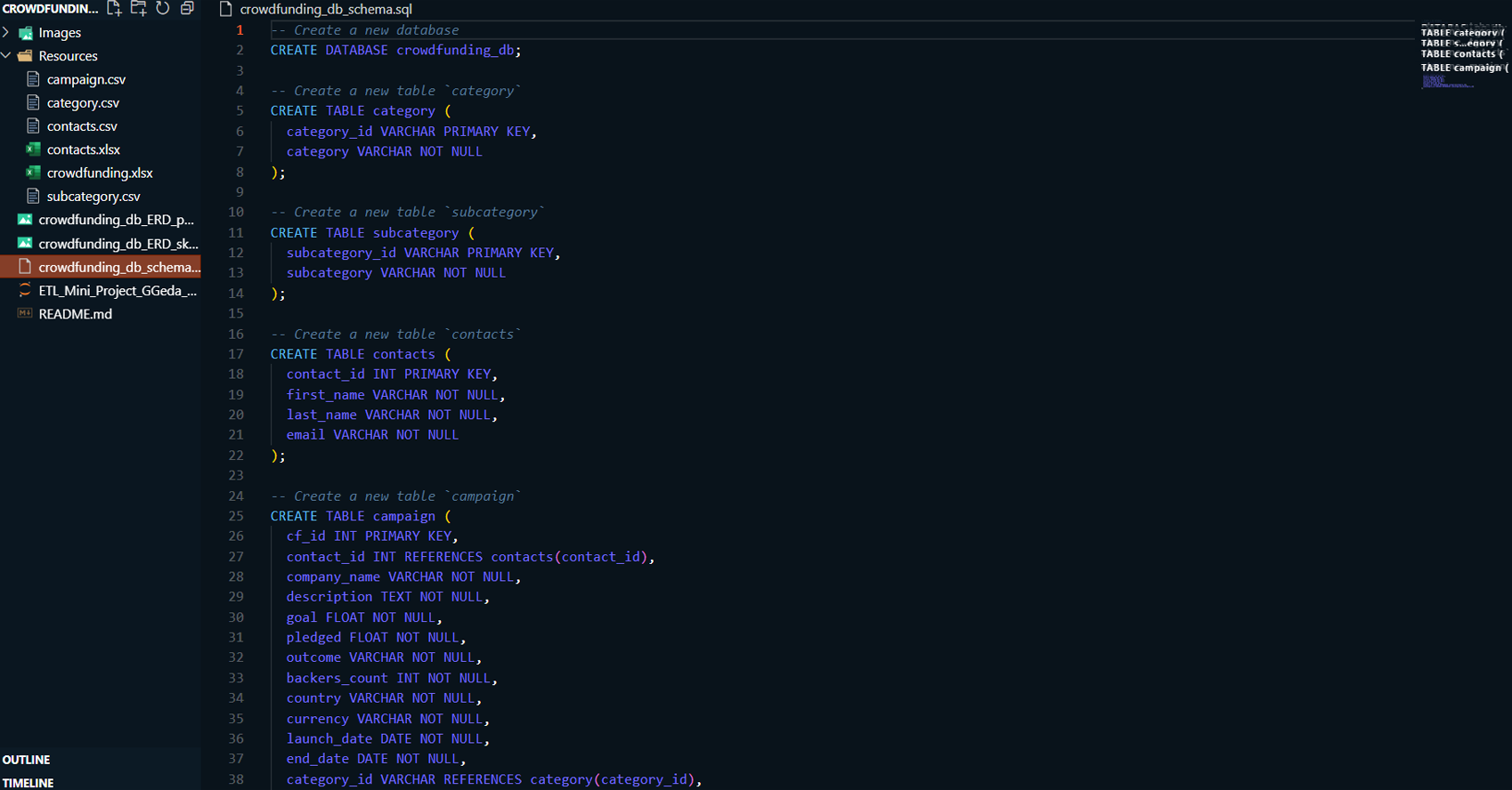
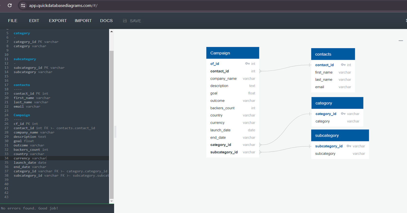
Designed and documented the database schema using
Entity-Relationship Diagrams (ERD) for better
understanding and implementation.
-
Created SQL schema files to define tables, primary
keys, foreign keys, and constraints.
-
Database Creation and Verification:
-
Created and configured a PostgreSQL database to
store the transformed data.
-
Loaded CSV files into the PostgreSQL database and
verified the data integrity using SELECT statements.
-
Collaboration:
-
Collaborated with other team member to ensure data
integration.
GitHub Link: To see my project on GitHub
please click GitHub Repository button below
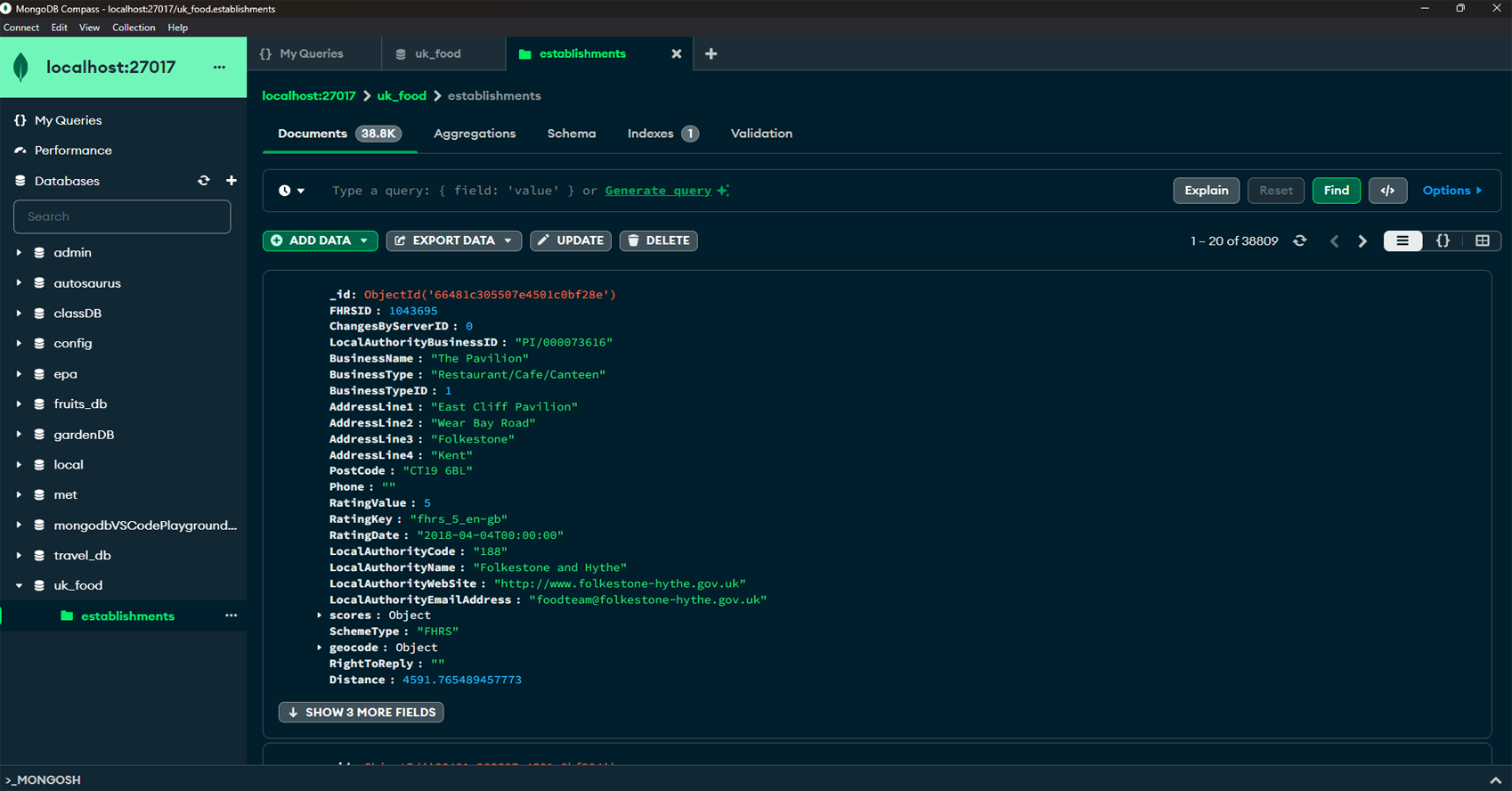
Project Summary:
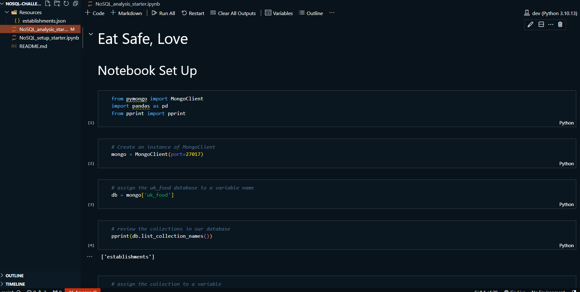
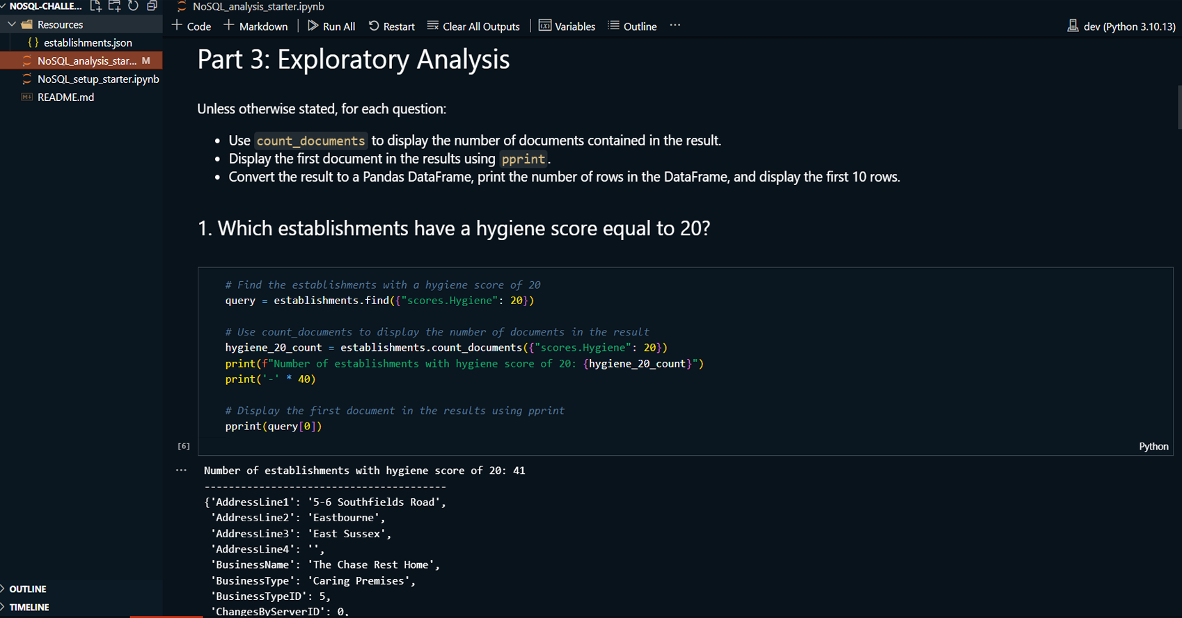
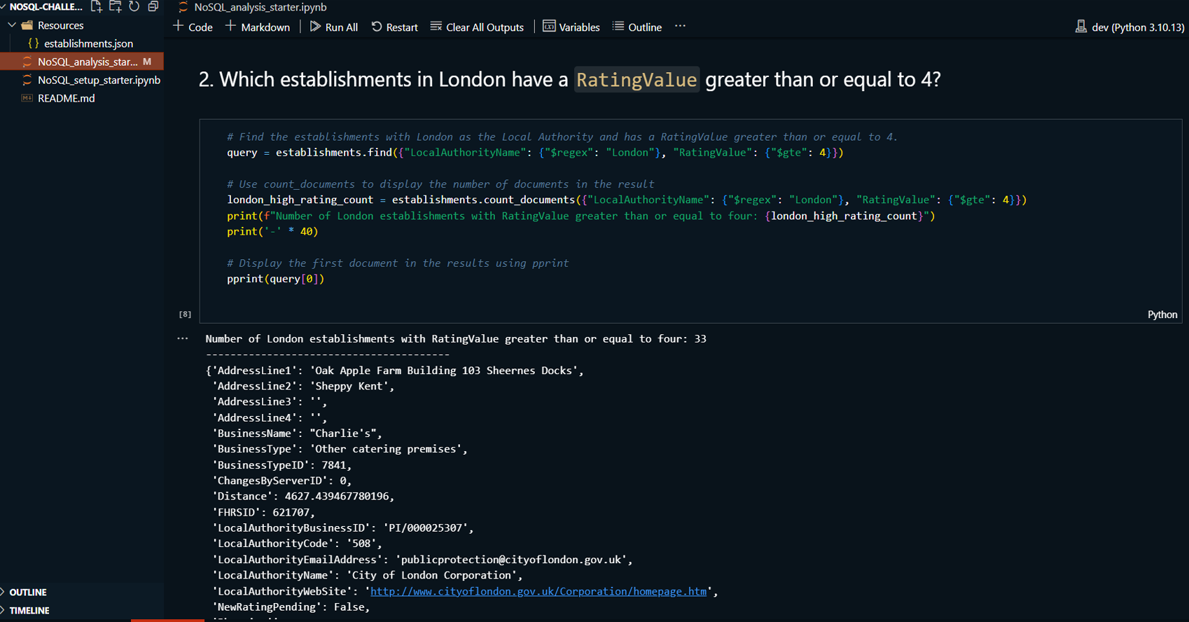
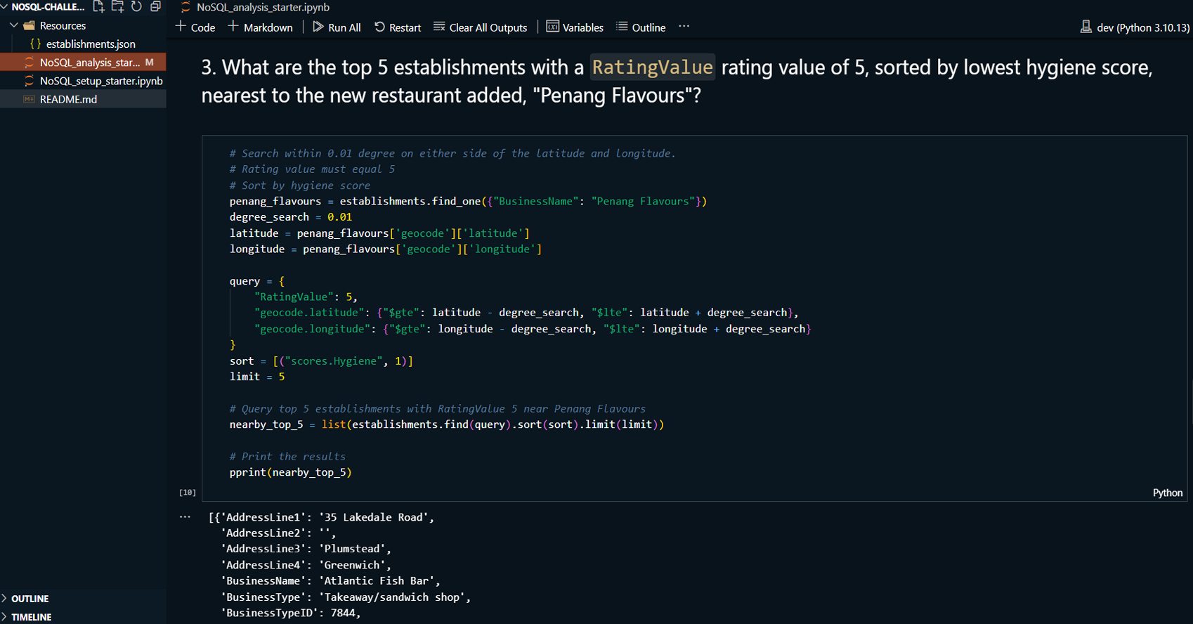
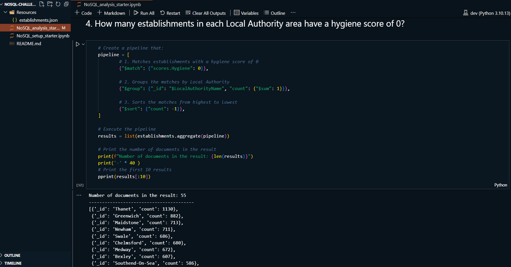
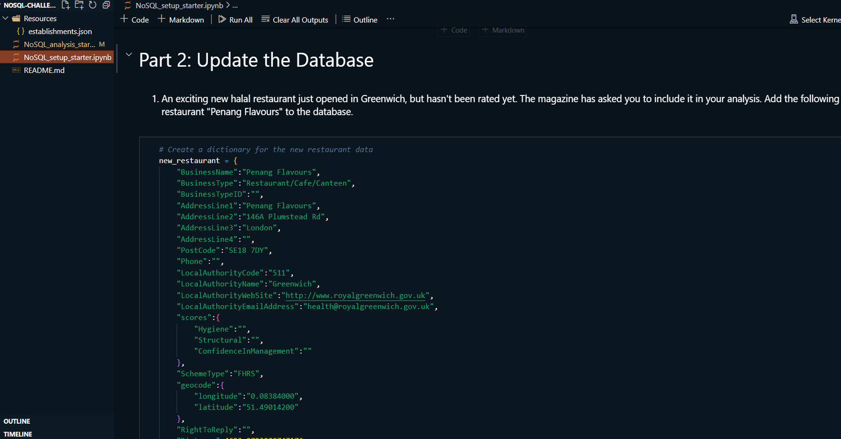
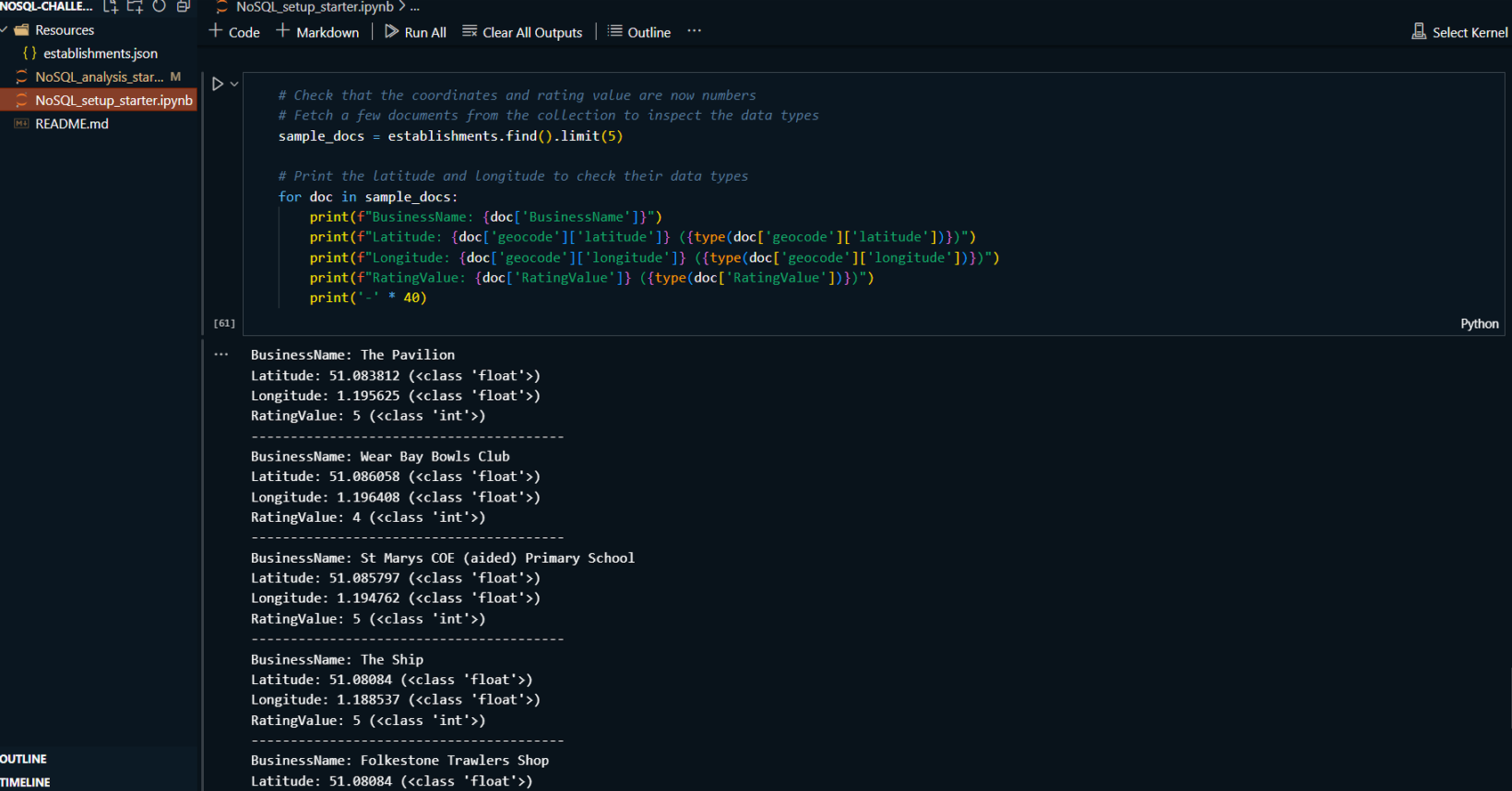
This project demonstrates the use of MongoDB Compass and
Jupyter Notebook to manage and analyze a MongoDB database
containing information about food establishments in the UK.
The project involves importing data, updating records, and
performing exploratory data analysis. MongoDB Compass is
used for visualizing and managing the database, while Python
with a Jupyter Notebook is used for additional querying and
analysis tasks.
Read More
Technologies:
-
MongoDB Compass: For visually managing
the MongoDB database, importing data, and running
queries.
-
MongoDB: For database operations like
data insertion, updates, and querying unstructured data.
-
Python: For scripting database
interactions
-
pymongo: For MongoDB operations
from Python.
-
pandas: For data manipulation and
analysis.
-
json: For handling JSON data.
-
Jupyter Notebook: For documenting and
executing the database operations.
Highlighted Skills:
-
Data Preprocessing Imported and
explored cryptocurrency market data, cleaned and
normalized it using StandardScaler.
-
Model Building: Implemented K-Means
clustering on the original and PCA-transformed data,
determining the optimal number of clusters using the
Elbow method.
-
Dimensionality Reduction: Applied PCA
to reduce the dataset to three principal components
while retaining 89.5% of the original variance.
-
Visualization: Created Elbow curves and
scatter plots to visualize clustering results and
compare original data with PCA-reduced data.
-
Analysis & Reporting: Analyzed and
interpreted the clustering results, providing insights
into the behavior of cryptocurrency clusters and the
impact of dimensionality reduction.
GitHub Link: To see my project on GitHub
please click GitHub Repository button below
